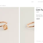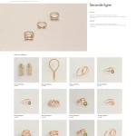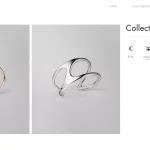
For the new season of Hermes Jewelry, following the trend of utilizing mini websites for collection presentations, we were once again entrusted with the project. Our partnership continued, reflecting a shared commitment to innovation and excellence.
This season’s updates included a comprehensive refresh of the user interface, focusing on color schemes, spacing, and overall layout. The goal was to enhance user engagement and bring forward a cleaner, more sophisticated presentation that aligns with Hermes Jewelry’s brand values.
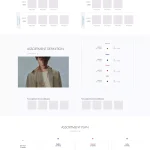
To accommodate varying viewing preferences on Windows laptops, we developed three different layout sizes. This was aimed at ensuring optimal display and interaction across different zoom levels, allowing for a seamless and detailed exploration of the jewelry collection.
Screenshots